Texture Online, 2010, Silk Fabric Texture 07. [online] Available at: <http://www.textureonline.com/silk-fabric-texture-07> [Accessed 02 Mar 2014].
I have applied an Oil Paint filter to this texture as it gives the image a more professional look than the silky effect. I have increased the saturation to +40 % as the enriched colour has a more vivid look. I think that this will provide a nice base for the Rom/Com/Action theme I am creating for the DVD. I merged the Saturation Layer Mask with the texture layer and used this as the starting layer for my template called background. I have ensured that it goes right to the edge of the bleed section so there will be no white when the inlay is cut. As this texture is free to use, there are no copyright infringements.
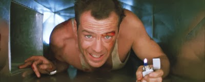
Next, I have decided to add some pictures to the back cover of the DVD cover. I have found some good images for the theme of my movie. I added them in to the back cover to show a glimpse of the film.
Back Image 1
Mail Online, 2011, Move over Bruce Willis! Rosie Huntington-Whiteley shows her action-heroine credentials in a white vest, [online] Available at: <http://www.dailymail.co.uk/tvshowbiz/article-1359189/Rosie-Huntington-Whiteley-shows-action-heroine-credentials-white-vest.html> [Accessed 02 Mar 2014]
Back Image 2

Paragraph film reviews, 2013, Monthly Archives: December 2013, [online] Available at: <http://paragraphfilmreviews.com/2013/12/> [Accessed 02 Mar 2014]
Back Image 3
Solar Navigator, DIE HARD and BRUCE WILLIS, [online] Available at: <http://www.solarnavigator.net/films_movies_actors/die_hard.htm> [Accessed 02 Mar 2014]
In order to display these photos in my project, I had to open them in a separate photoshop file, resize the images via the Image > Image size menus and then duplicate that layer into my project file. I then used the move tool to place them in the correct location. I have also used the transform controls to make slight adjustments to the size of the pictures to fit my specification as well as making use of the snap feature to correctly line them up together. Finally, I have added a 1 px black boarder on the inside of the images to give them a frame. I achieved this via the edit and then stroke menu.
As Back Image 3 looks a lot more faded and older than the other two images, before I duplicated it into my project, I increased the levels of the image and applied these changes to make the image look newer and fresher. Now Back image 3 looks better but it's still too dark so I also increased the brightness to 44 and the contrast to 22. The image is now looking a lot clearer, fresher and blends a lot better with the other two back images.
After editing back image 3, I have noticed a few improvement that I could make to back image 2. I increased the levels on back image 2 to increase the quality of the image. I then increased brightness to 30 and contrast to 20. I applied all of these changes and merged the layers.
The pictures have been taken from news or review sites. As this is for educational purposes, I have not infringed any copyright laws, however I would have to ask permission to use these images under different circumstances. If I were making this movie for real, I would be able to use images from the production of the film.


No comments:
Post a Comment